
Brand Re-Invention: Because Old is Boring and Change is Good
>> Tuesday, November 30, 2010
Bored of the same look? Tired of the Business as Usual at work? Need a change? Need to do something new to just stand up and get noticed? Everyone, or at least most of us have these questions running through our minds from time to time. How do we answer them? Get a new, fancy, expensive haircut that attracts instant attention or just shed off those extra kilos and have people notice you and ask you how you managed it.
In this context it seems interesting to compare people and brands. Aren't they like a million people competing in the market trying to stand out and be number one? The answer is yes, and like you and me, even brands need that timely makeover - whether it’s changing the logo design, doing something new for its customers or just changing the way a brand markets its products. It is no secret that it pays when Brands regularly reinvent themselves and not take their customer base for granted.
Change in brand logos are the most exciting from a customer point of view. Love it or hate it, you can’t help but notice it! On one hand the public get enthusiastic about finding out the reasons for the change and the motivation behind a completely different looking logo and then on the other hand you have the critics who do an in depth analysis and come out with reasons to claim the new logo probably won't work. Either way, it gets people to talk about the brand and that's more or less half the battle won.
Many Indian brands are looking at re-branding and reinvention the most recent being the Airtel logo change. In the recent past there have been the Videocon, Vodafone and the Cafe Coffee day stories, to name a few, which made heads turn and got people talking. What's amazing is that these brands were not failing; they just realized they couldn't be doing the same thing year on year!
The highlights of the stories...
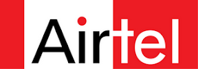
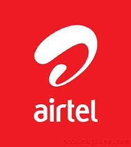
1. When Bharti Airtel went from Rectangular to Curvy(Nov 2010)
When you have to satisfy 200 million customers world over, you’d bet that coming across as more innovative will definitely pay-off even if it means spending Rs 300 crores on the revamp! Keeping that in mind, Airtel has gone from the somewhat boring rectangular box like logo to a more modern and catchy curvy creation that sets the brand name free from the logo itself. The logo retains the dominance of red, which seems to have worked for the brand over the years.
Reasons for the change?
Today as we expand on the global stage, this new brand identity gives us the opportunity to present a single powerful and unified face to our customers, stakeholders and partners around the world,” said Sunil Bharti Mittal, Chairman and MD of Bharti Airtel (Source : www.business-standard.com).
Materminds behind the new look: Brand Union
 |
| From Brand Re-Invention |
 |
| From Brand Re-Invention |
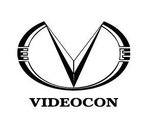
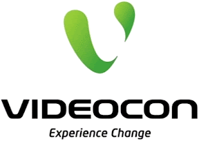
2. When Videocon went green with Chouw and Mouw (July 2009)
A new tagline "Experience Change" and a new flashy green logo, courtesy Interbrand Singapore, showed that Videocon was attempting some serious brand reinvention. The logo went from being a conventional 'V' - seemingly rigid and not so open to change, to a more flexible and fluid version which has two disjoint parts. What's more, the two parts of the 'V' have been transformed to life in the form of Chouw and Mouw. The bright green color, apart from adding the "fresh" factor, is in line with the brands attempt to portray itself as an Eco-friendly brand.
Reason for the change?
A starting point ahead of plans of diversifying into areas such as telecom and DTH.
 |
| From Brand Re-Invention |
 |
| From Brand Re-Invention |
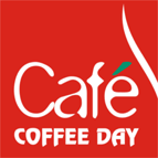
3. When Cafe Coffee Day enforced “dialogue”(Oct 2009)
The stylish dialogue box logo just emphasizes the brands punch line "A lot can happen over coffee". The idea was to provide a better in-cafe experience and encourage a more interactive environment while sipping on some freshly brewed recopies. Everything suddenly changed right from the logo to the cutlery that was being used to what the waiters were wearing! Old brand yet the new look and feel certainly worked for CCD. The change was brought about by Landor Associates who made sure that every stakeholder was part of the whole exercise.
 |
| From Brand Re-Invention |
 |
| From Brand Re-Invention |
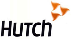
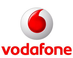
4. When Vodafone replaced hutch, Spikey took over from Chika and Red became the new pink/orange(2007)
It’s not as simple as hutch becoming Vodafone! It went from Maxtouch to Orange to Hutch and then finally Vodafone. If changing the brand name wasn't enough, the logos and brand ambassadors were also changing simultaneously; from orange to pink and blue to red, you almost had the whole pallet and from one pug to another, even the doggie community had some serious competition going on for it! Ogilvy and Mather did not let the brand down in terms of creativity and introducing the changes to the public. With an advertising budget of 320 crores and Vodafone was clearly looking at taking on the Indian Market and becoming the new name of telecom services in the country.
 |
| From Brand Re-Invention |
 |
| From Brand Re-Invention |


